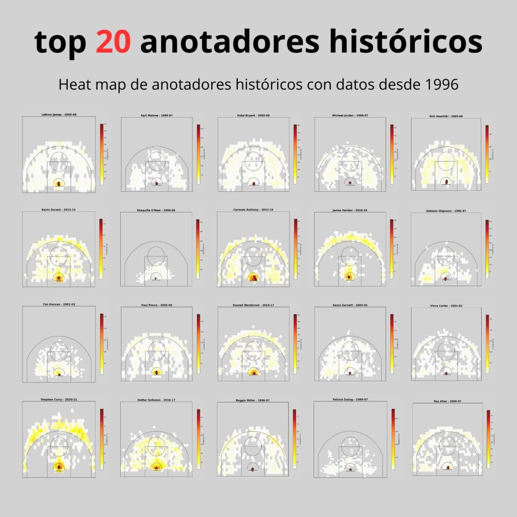
🏀 The 1996 season was a key milestone in the NBA, as it marked the first time shot locations began to be consistently recorded with coordinates (LOC_X, LOC_Y). This data is essential for creating visual graphics such as heatmaps, which help us better understand the game.
📊 On the list of the greatest scorers in history, we find players from past eras, even from the ABA (the league that preceded the NBA), for whom no such data exists. Still, thanks to these records, we can now visualize—with heatmaps—the majority of players on that list and their best scoring seasons, or for 1990s players, their most notable scoring years after 1996.
💻 Using data collected from nba_api, and processed with Google Colab and Python, we can generate these player heatmaps. The charts display shot volume: white zones represent areas with fewer attempts, while dark red zones indicate areas with higher shot volume.
🔄 These visualizations clearly show how the style of play has changed over time, reflecting the evolution of basketball.