🧠 I’m exploring new ways to visualize NBA data, combining statistical analysis with visual design.
This time, I created an interactive dashboard to represent the performance of Shai Gilgeous-Alexander, one of the most impactful players of the 2024–25 season and a serious MVP candidate.
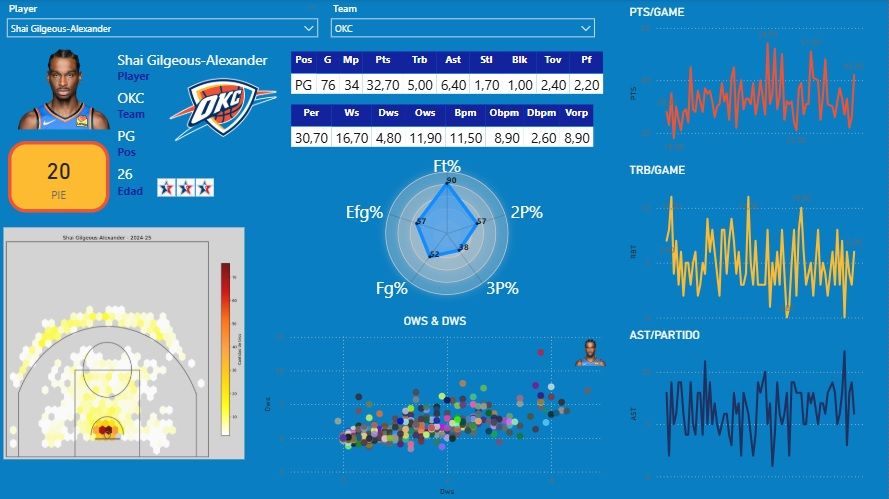
The visualization includes:
Shooting efficiency radar (eFG%, 2P%, 3P%, FT%)
Heat zone shot chart 🏀🔥
Points, rebounds, and assists per game curves 📊
Advanced metrics such as BPM, VORP, and Win Shares
SGA has taken OKC to the next level:
🔹 30.7 pts / 5.0 reb / 6.4 ast / 1.7 stl
🔹 11.5 BPM and 8.9 OBPM — elite figures
🔹 20 PIE (Player Impact Estimate)
This type of visualization helps condense a lot of information into a small space, making analysis more accessible for both fans and professionals alike.